As probably many of the data scientist, I wanted to ease my anxiety caused by the COVID-19. I decided to look at the data related to the pandemic. I decided not to look at the daily cases as John Burn-Murdoch from Financial Times and the team Our World in Data are doing a great job. The reasons why I decided to look at deaths are explained in the Motivation section.
I am a computational biologist and all the plots I am making here are just observations. I am not claiming any conclusions, nor do I do any predictions. All the code is open source, and free for anyone to use, available on github.
Also, very warm thanks to Kaspar for his help with decisions regarding color schemes and advice.
If I would to choose the most useful output of this whole notebook I would say functions to read in the ONS data. And trying to figure out how to deal with ONS constantly changing the file formats and organization of the data.
Motivation
I decided to look into the mortality rates because I wanted to put the numbers reported by the government in some context. My first question was whether the deaths reported as COVID-19 deaths were a subset of deaths one could expect to see this year? How much COVID-19 increases the death toll? And finally, how does the age distribution of fatalities look?
The data I plotted below shades a bit of light on those topics, but for a more in-depth answer, we will have to wait. I expect many PhD thesis investigating the socioeconomic impact of the pandemic, causes for mortality and the differences between countries and much more. Nevertheless, I still think the following is quite interesting. If not for others, then for the sole reason of looking at the data in almost real-time.
Setup
Loading up the necessary packages (installing them if they are missing). Setting up defaults and tweaking the plotting defaults.
Data comes from two spreadsheet - 2020 (new data) and 2019 to see the trend. The 2020 will be changed each week, while 2019 remains stable.
Note: Unfortunately due to formatting of the data the following code is not entirely reproducible as there are parts of it that would have to be adjusted with each reiteration of the spreadsheet. ~In theory the code should be backward compatible, but I haven’t checked that in practice.~ The spreadsheet is almost as variable as the data.
2019 baseline
Adding 2019 figures to establish a baseline comparison.
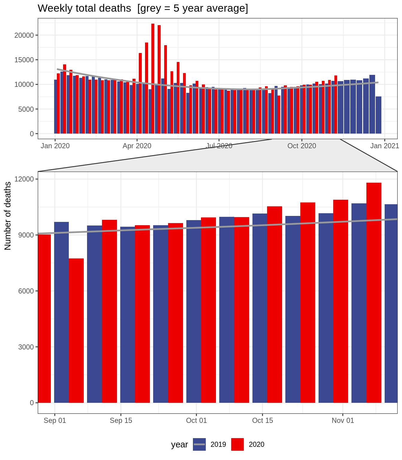
The number of deaths reported in the news is increasing, and though the data here lags, it looks like the number of deaths is slightly increasing.
Code
total<-df_all%>%filter(value=="total_deaths")%>%ggplot(aes(x =week_, y =number_of_deaths, fill =year))+geom_bar(stat ="identity", position ="dodge")+geom_smooth(data =filter(df_all, value=="total_deaths_ave5"&year=="2019"), color ="grey60", se =FALSE)+facet_zoom(xy =week_<data_up_to+1&week>=second_covid_week, horizontal =FALSE, show.area =FALSE)+labs(y ="Number of deaths", title ="Weekly total deaths [grey = 5 year average]")+theme(axis.title.x =element_blank())+scale_fill_aaas()total
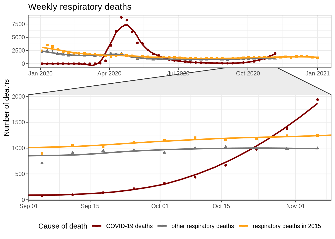
Respiratory deaths
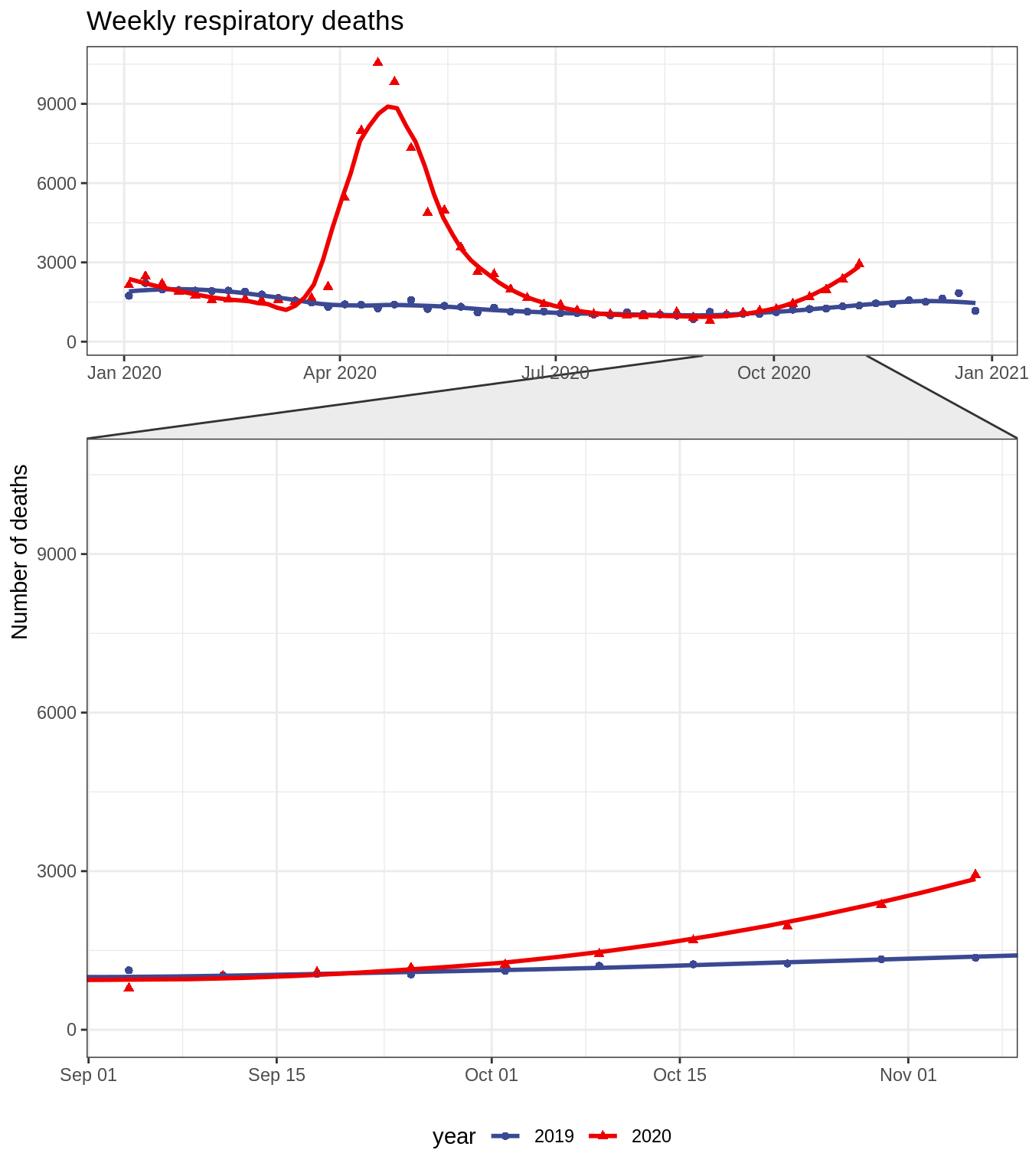
COVID-19 deaths - those with COVID-19 mentioned on the death certificate and those without, result in higher than last year numbers of respiratory deaths. The numbers seem to be increasing and with a slightly higher average daily total than the one reported in the news.
Code
upper_limit<-df_all%>%filter(value=="respiratory_deaths")%>%pull(number_of_deaths)%>%max()+100respiratory<-df_all%>%filter(value=="respiratory_deaths")%>%ggplot(aes(x =week_, y =number_of_deaths, group =year, color =year, shape =year))+geom_point()+geom_smooth(se =FALSE, span =0.3)+facet_zoom(xy =week_<data_up_to+1&week>=second_covid_week, horizontal =FALSE, show.area =FALSE)+scale_color_aaas()+labs(y ="Number of deaths", title ="Weekly respiratory deaths")+theme(axis.title.x =element_blank())+coord_cartesian(ylim =c(0, upper_limit))respiratory
However, the total number of COVID-19 deaths has already put the total number of respiratory deaths above the total 2019 respiratory deaths. And its increasing again.
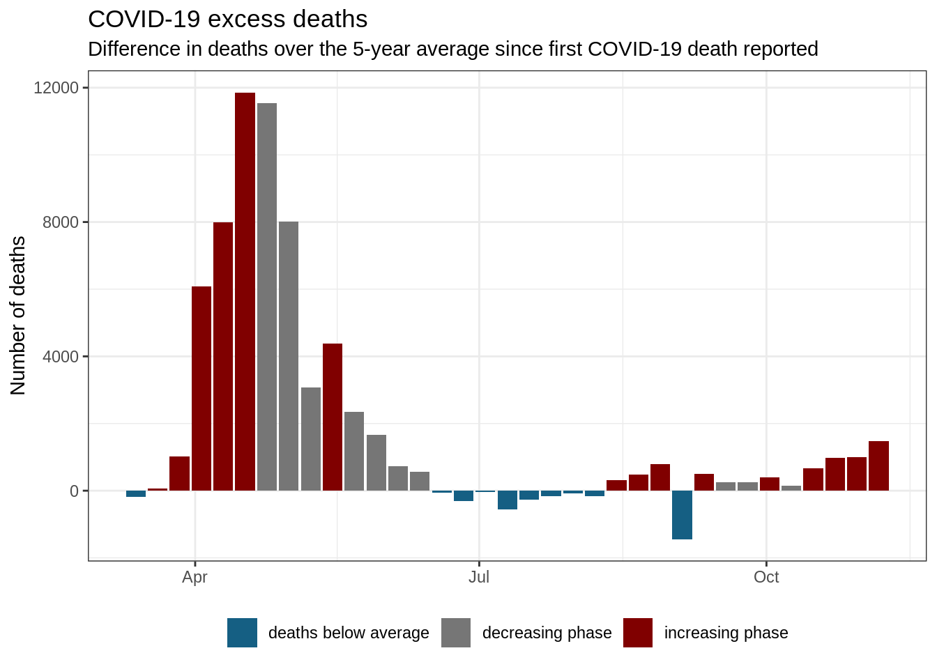
Excess deaths - proxy for all COVID-19 related deaths
In this plot, I am looking at the difference in total number of deaths reported in the period since the first COVID-19 related death was reported and the 5-year average.
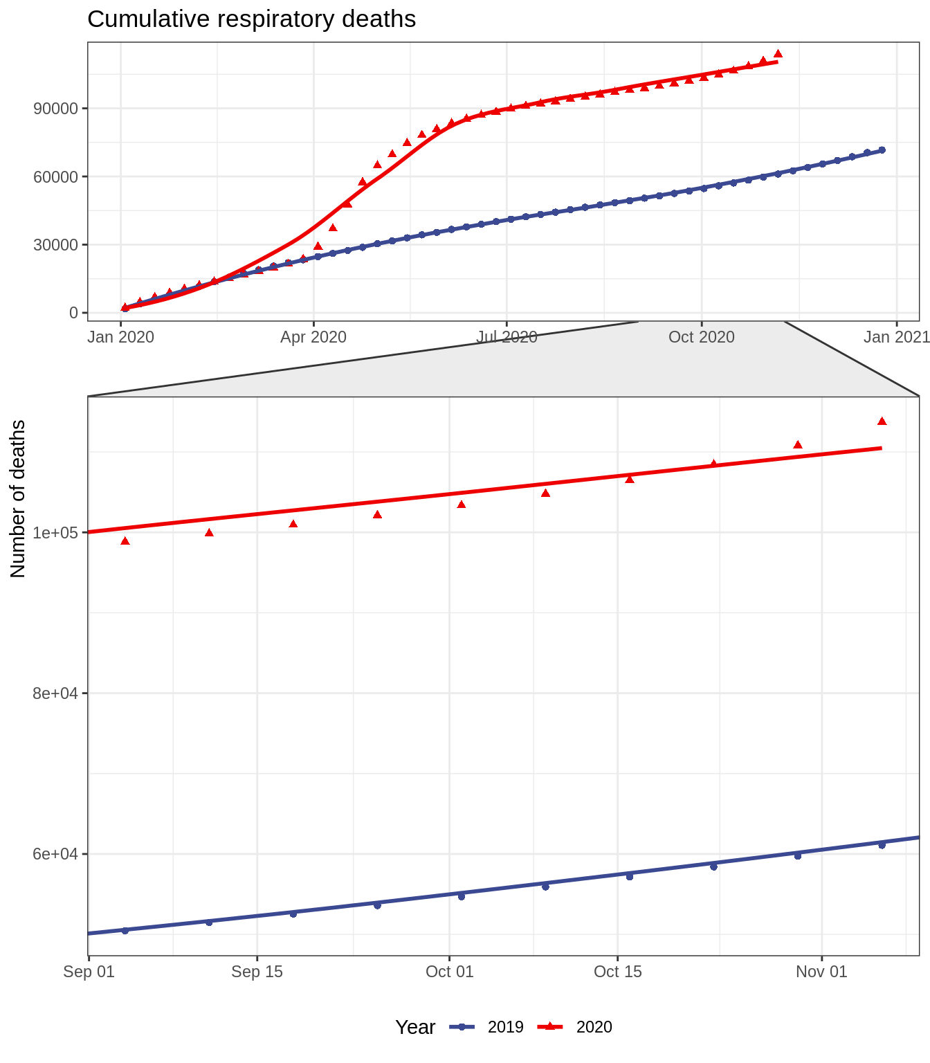
While we see that we entered the increasing phase, the increase seem to be less steaper.
Code
col_scheme<-pal_uchicago()(5)[c(1:2,5)]names(col_scheme)<-c("increasing phase", "decreasing phase", "deaths below average")df_2020_excess<-df_2020_%>%filter(!is.na(number_of_deaths))%>%group_by(week)%>%filter(any((value2=="covid_deaths")&(number_of_deaths>0)))%>%ungroup()%>%filter(value2%in%c("total_deaths", "total_deaths_ave5"))%>%select(-value)%>%pivot_wider(names_from =value2, values_from =number_of_deaths)%>%mutate(difference =total_deaths-total_deaths_ave5, fract =difference/total_deaths_ave5, week_ =lubridate::ymd("2020-01-03")+7*(as.numeric(week)-1), group =ifelse(difference<0,"deaths below average",ifelse(difference>lag(difference),"increasing phase","decreasing phase")))all_excess_deaths<-df_2020_excess%>%pull(difference)%>%sum()all_deaths<-df_2020%>%filter(value=="total_deaths")%>%pull(number_of_deaths)%>%sum()fraction_excess<-all_excess_deaths/all_deathsexcess_plt<-df_2020_excess%>%ggplot(aes(week_, difference, fill =group))+geom_bar(stat ="identity")+scale_fill_manual(values =col_scheme)+theme(legend.title =element_blank(), axis.title.x =element_blank())+labs(y ="Number of deaths", title ="COVID-19 excess deaths", subtitle ="Difference in deaths over the 5-year average since first COVID-19 death reported")excess_plt
England & Wales has enetered the second wave. Up to Nov, 06 at least 63 287 more people died when compared to the 5 year average. This means that 12.2% of all deaths this year were directly, or indirectly caused by COVID-19 (taking the excess mortality over the 5 year average as best proxy for number of deaths as a result of pandemic).
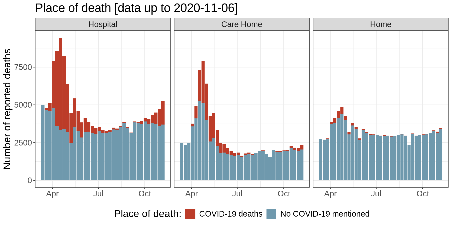
Place of death
Code
fract_place_of_death<-place_of_death%>%filter(place!="All deaths",country=="England and Wales")%>%mutate(place =gsub("Hospital \\(acute or community, not psychiatric\\)", "Hospital", place), place =gsub("Other communal establishment", "Other communal\nestablishment", place))%>%group_by(cause)%>%mutate(fract =round(number_of_deaths/sum(number_of_deaths)*100, 2))
As of Nov, 06, majority of the deaths are reported in hospitals. However 35% of deaths occur outside of hospitals. Thankfully, all numbers seem to be going down, with hospital deaths dropping below the numbers from the beginning of the epidemic.
We saw increase in almost all places of death followed, thankfully by decrease.
My observations:
COVID-19 accounted only for some of the increase.
My speculation: Was that the case because no test was carried out? I find it unlikely, as the deaths reported to ONS don’t have to be verified by testing to be classified as COVID-19 related. It might be, for example, because people are scared to go to the hospitals.
Also, as have been already reported, the outbreak in care homes started later, hence we are seeing an increase in COVID-19 related deaths in those facilities.
We see that number of deaths with no mention of COVID-19 decreased in the hospitals and increased in recent weeks. I hypothesize it potentially can be explained by increase in deaths in other places, less road accidents and less scheduled medical interventions. When the lockdown has been lifted we could potentially see the increase in accidents.
However, there are many other potential reasons for the increase in deaths this year. Some of them can include impaired mental health.
Note:Many thanks to German (and David Spiegelhalter plots) for making me realise a mistake in the earlier iteration of the following plot!
Code
place_of_death_long%>%filter(country=="England and Wales")%>%mutate(place =gsub("Hospital \\(acute or community, not psychiatric\\)", "Hospital", place), place =gsub("Other communal establishment", "Other communal\nestablishment", place), week_ =ymd("2020-01-03")+7*(week-1), number_of_deaths =as.numeric(number_of_deaths))%>%pivot_wider(names_from ="cause", values_from =number_of_deaths)%>%mutate(`No COVID-19 mentioned` =`Total deaths`-`COVID-19 deaths`)%>%select(-`Total deaths`)%>%pivot_longer(names_to ="cause", values_to ="number_of_deaths", -c(place, country, week, week_))%>%group_by(place)%>%mutate(max_deaths =max(number_of_deaths))%>%ungroup()%>%mutate(place =reorder(place, -max_deaths))%>%filter(place%in%c("Care Home", "Home", "Hospital"))%>%ggplot(aes(week_, number_of_deaths, fill =cause))+geom_bar(stat ="identity")+scale_fill_manual(values =pal_nejm()(6)[c(1,6)])+facet_wrap(~place)+labs(title =paste0("Place of death [data up to ", data_up_to, "]"), y ="Number of reported deaths", fill ="Place of death:")+theme(axis.title.x =element_blank(), text =element_text(size =16))
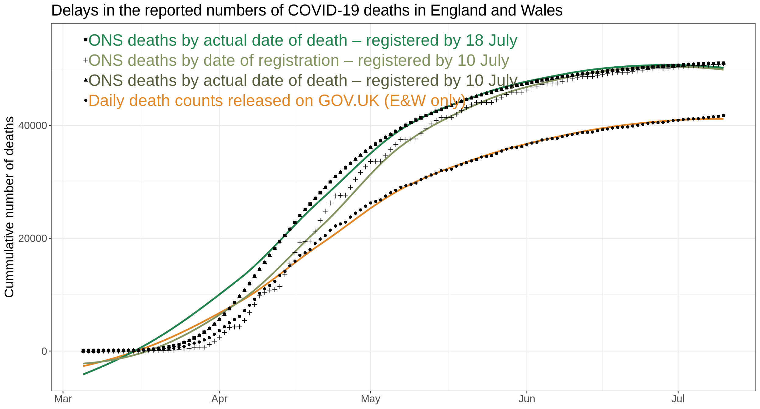
Differences between the reported numbers
The numbers reported by the government are lower than the actual number of deaths each day. Some of that comes from the delay in confirming the cause of death. Because ONS changed the organisation of the data the discrepancies in the data can be only shown up to 10 Jul.
All the comparisons between previous years (in the earlier parts of this notebook) are done based on figures from ONS deaths by date of registration – registered by 06 Nov set for compatibility with earlier datasets.
Code
col_scheme<-c("#E18727", "#849460", "#56603F", "#20854E")names(col_scheme)<-unique(actual_vs_reported$source)[1:4]label_postions<-actual_vs_reported%>%filter(source%in%names(col_scheme))%>%group_by(source)%>%mutate(max =max(number_of_deaths))%>%arrange(Date)%>%mutate(deaths_on_that_day =number_of_deaths-lag(number_of_deaths), max_on_day =max(deaths_on_that_day, na.rm =TRUE))%>%ungroup()%>%filter(Date==lubridate::ymd("2020/03/6"))%>%arrange(-max)%>%mutate(fixed_position_cum =1.15*max(max)-0.07*max(max)*1:length(col_scheme), fixed_position_daily =1.15*max(max_on_day)-0.07*max(max_on_day)*1:length(col_scheme))discrepancies<-actual_vs_reported%>%filter(source%in%names(col_scheme))%>%ggplot(aes(x =Date, y =number_of_deaths, color =source, shape =source))+geom_smooth(se =FALSE)+geom_point(color ="black")+geom_text(data =label_postions, size =7, hjust =0,aes(x =Date, y =fixed_position_cum, label =source))+geom_point(data =label_postions, color ="black",aes(x =as_datetime(ymd(Date)-0.5), y =fixed_position_cum, shape =source))+theme(legend.position ="right")+#scale_color_nejm() +scale_color_manual(values =col_scheme)+guides(color =guide_legend(nrow =2, byrow =TRUE))+theme(axis.title.x =element_blank(), text =element_text(size =16), legend.position ="none")+labs(color ="Source", shape ="Source", y ="Cummulative number of deaths", title =paste0("Delays in the reported numbers ","of COVID-19 deaths in England and Wales"))discrepancies
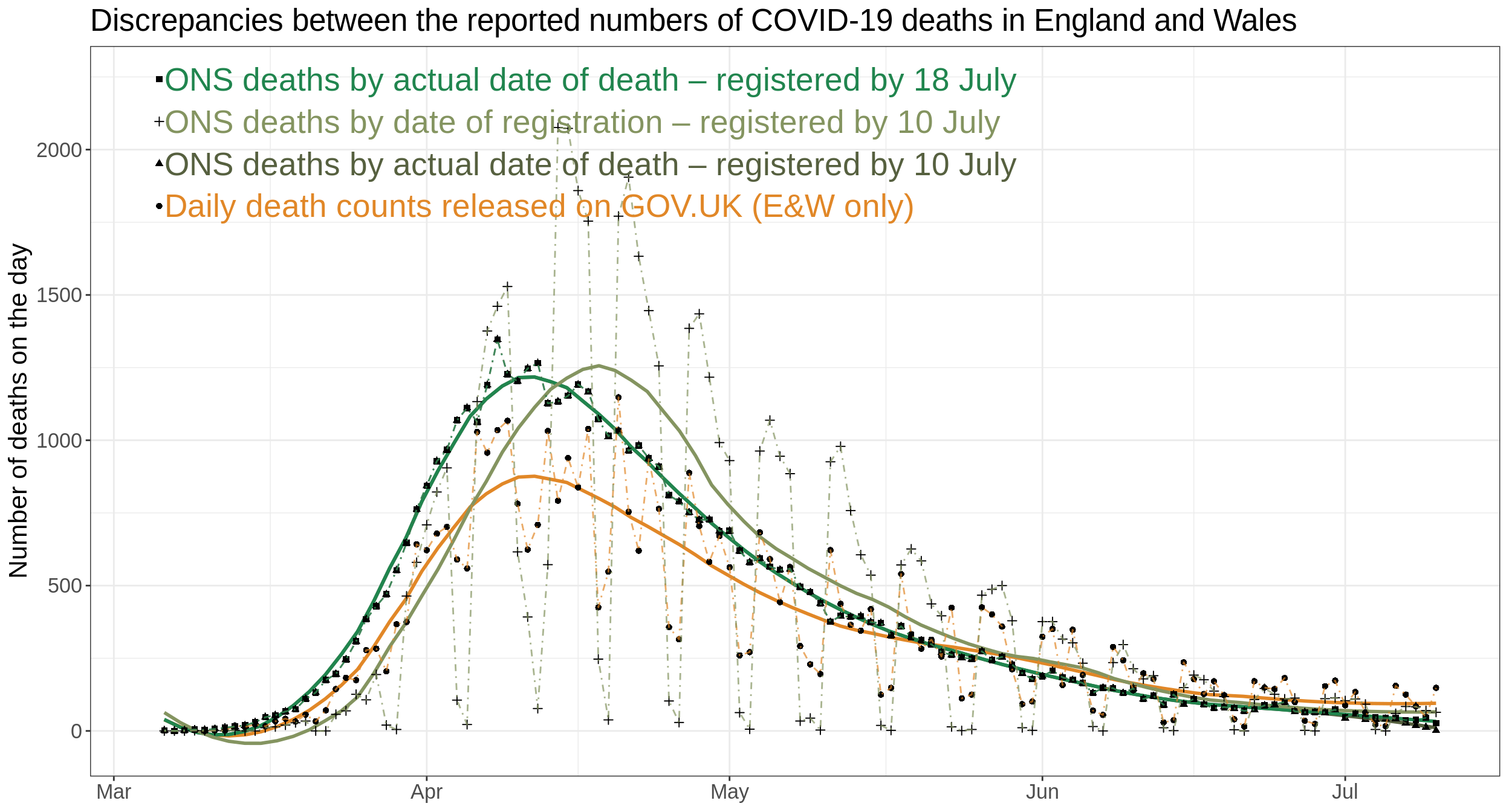
Looking at the daily death rates it becomes clear that (1) data is very noisy and (2) there is a significant lag in the data.
We see that ONS data is especially influenced by the weekends and bank holidays. The reported numbers drop on the weekends (March 21 & 22, 28 & 29, April 4 & 5, Easter weekend, and so on) and are higher in the next days.
Code
actual_vs_reported%>%filter(source%in%names(col_scheme))%>%group_by(source)%>%arrange(Date)%>%mutate(deaths_on_that_day =number_of_deaths-lag(number_of_deaths))%>%ggplot(aes(x =Date, y =deaths_on_that_day, color =source, shape =source))+geom_smooth(se =FALSE, span =0.3)+geom_point(color ="black")+geom_line(aes(group =source), alpha =0.7, linetype ="dotdash")+geom_text(data =label_postions, size =7, hjust =0,aes(x =Date, y =fixed_position_daily, label =source))+geom_point(data =label_postions, color ="black",aes(x =as_datetime(ymd(Date)-0.5), y =fixed_position_daily, shape =source))+scale_color_manual(values =col_scheme)+guides(color =guide_legend(nrow =2, byrow =TRUE))+labs(color ="Source", shape ="Source", y ="Number of deaths on the day", title ="Discrepancies between the reported numbers of COVID-19 deaths in England and Wales")+theme(axis.title.x =element_blank(), legend.position ="none", text =element_text(size =16))
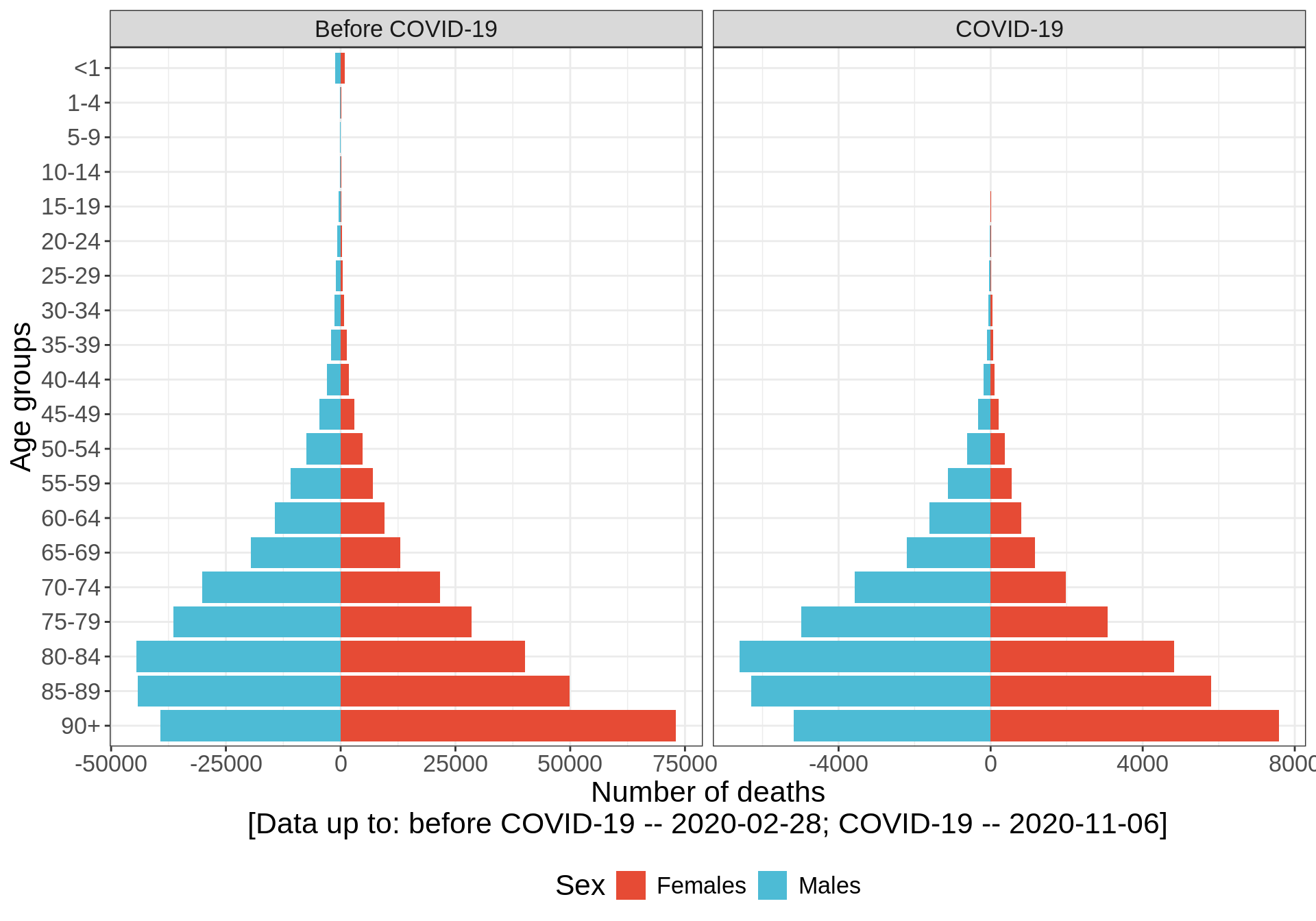
Age distribution
Looking at the deaths, Males are more affected than Females. How this plot looks like for cases? I.e. are men more susceptible? For that I am still looking a proper dataset.
I also wanted to compare the COVID-19 age and sex distribution with the UK population structure. I ended up comparing it to even more adequate data - to the deaths occurring in UK this year, before COVID-19. This will allow to put the age structure of COVID-19 into context.
Code
before_covid<-ymd("2020-02-28")age_distribution_bound<-bind_rows(age_distribution_all%>%mutate(type ="Before COVID-19"),age_distribution%>%mutate(type ="COVID-19"))%>%filter(sex!="Both")%>%group_by(sex, age_group, type)%>%summarise(number_of_deaths =sum(number_of_deaths))%>%group_by(type)%>%mutate(all_deaths =sum(number_of_deaths))%>%group_by(sex, type, age_group)%>%mutate(fraction_of_deaths =number_of_deaths/all_deaths*100)%>%ungroup()age_distribution_bound%>%mutate(age_group =factor(age_group, levels =rev(age_levels)), nod =ifelse(sex=="Females", number_of_deaths, -number_of_deaths))%>%group_by(age_group)%>%filter(sum(number_of_deaths)>0)%>%ggplot(aes(x =age_group, y =nod, fill =sex))+geom_bar(stat ="identity")+scale_fill_npg()+facet_wrap(~type, scales ="free_x")+# scale_y_continuous(breaks = break_axis,# labels = abs(break_axis)) +labs(x ="Age groups", y =paste0("Number of deaths\n[Data up to:"," before COVID-19 -- ", before_covid, "; COVID-19 -- ", data_up_to, "]"), fill ="Sex", title =)+coord_flip()+theme(legend.position ="bottom", text =element_text(size =16))
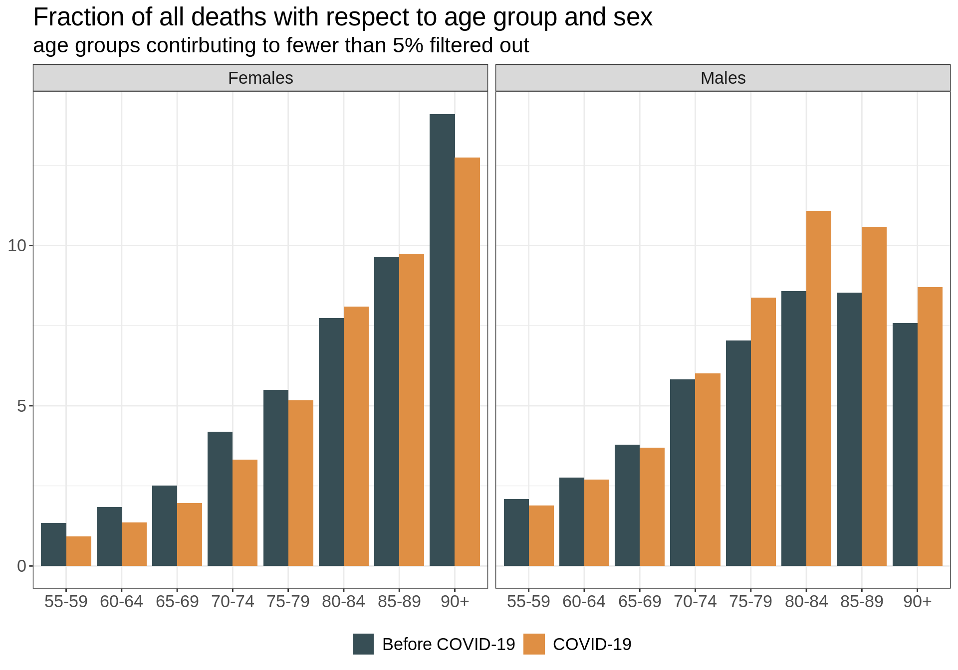
This is even more visible when we compare the fraction of all deaths in each age group and with respect to sex.