Data visualization in bioinformatics
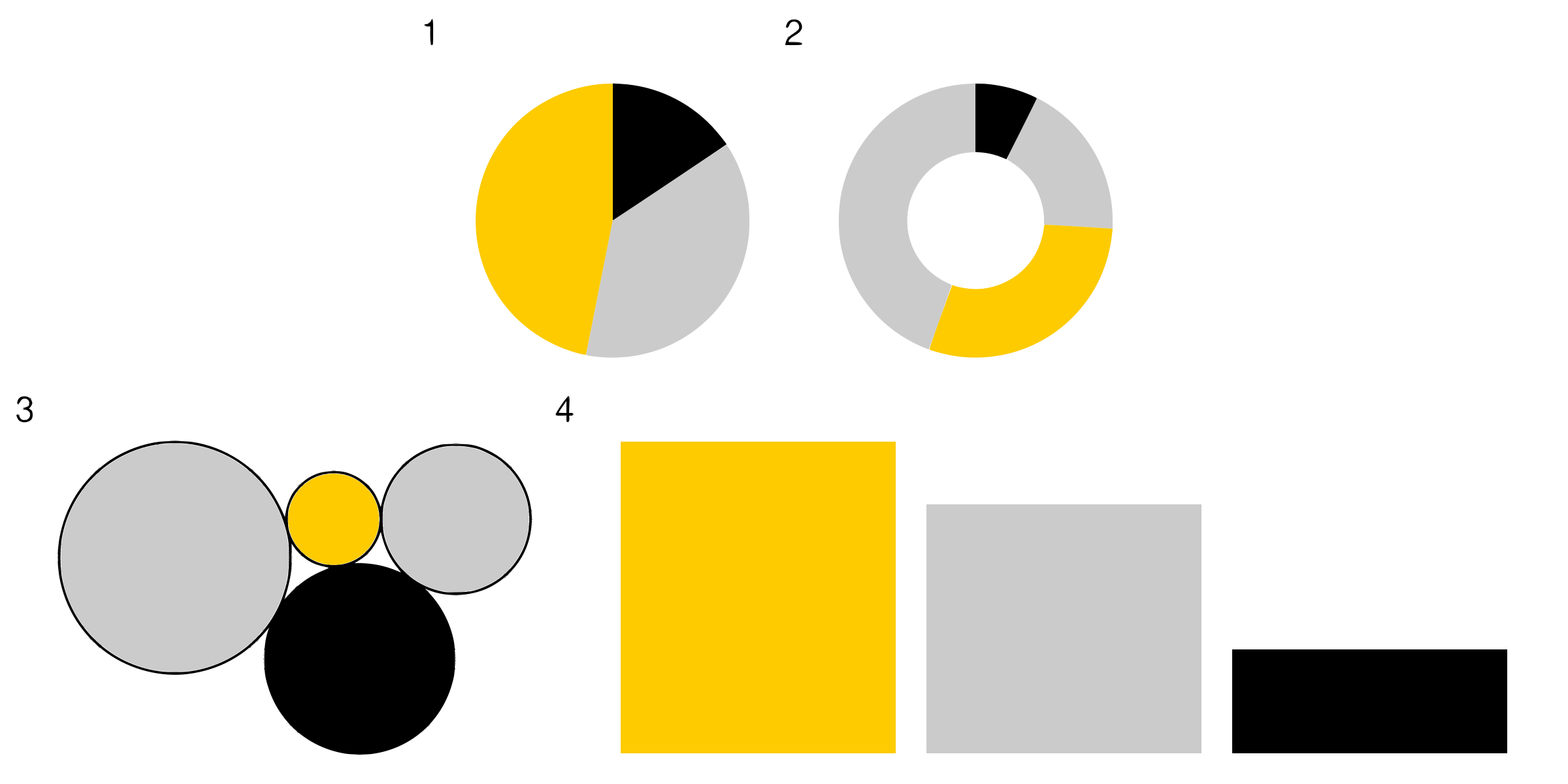
A good figure can speak a thousand words while a less perfect one can confuse the reader instead of telling the stories. Learning how to visualise and represent complex ideas, especially large datasets such as the ones we tend to work on daily basis is crucial part of a bioinformatician’s skill set. In this hackathon we will focus on telling stories with our plots. We will try to fix some confusing figures. We will also build our interactive graphs and animations, while also trying to understand when these are helping to convey the message and when they distract from the main points.
During this hackathon we explored what makes a good figure and how to avoid common pitfalls. We discussed which rules are important and which we can treat as suggestions.
During the hackathon the participants were tasked with creating compelling visualisations describing one of the Cancer types investigated within the TCGA consortium. Each team preapred a presentation presenting the cancer type and key results from the analysis of transcriptomic, mutation and clinical data. They created interactive visualisations and shiny apps that allowed users to investigate the results in more detail.